I was looking for ideas for my next post. I sat down with my gaming laptop and started reading through a few of my recent posts for inspiration. That laptop runs a dark Windows theme, so the browser shows sites in dark mode.
When I got to my DIY posts, I couldn’t read the parts list. The text was white on a pale tan card. I had reviewed both posts before publishing them, and they looked fine. They just didn’t look fine to anyone using dark mode.
So I went looking for a post idea and found a bug instead. It turned out to be a post idea too.
What happened
The problem was in two posts: the RV bedroom TV install post and the DIY shortcode styling post . Both use a “Parts & Tools” card that looks like graph paper with a strip of masking tape for a label. In dark mode, this is what it looked like:
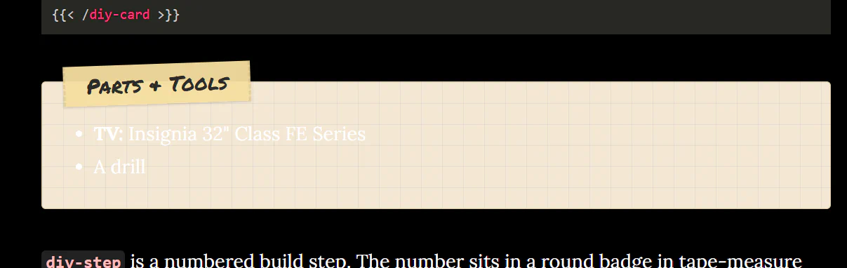
The label is fine. The list is almost gone.
I usually write and review posts on a different laptop. Unlike the gaming laptop, it isn’t a space heater, and it can run for more than an hour or two on battery. It also uses a light Windows theme. That’s where I checked these two posts, and the card looked exactly the way I meant it to. Nothing on the page hinted that dark mode would be different. I assumed I was good. I know better now.
Why it happened
This site uses the Beautiful Hugo theme. When your browser is in dark mode, the theme turns the page black and turns all the text white.
My card set its own background color, a light tan. It did not set its own text color. So the text took the page’s color instead. In light mode that’s dark gray, which looks fine on tan. In dark mode it’s white, which almost disappears.
The sticky notes in the same post were fine. They already set their own text color, so the theme’s white never reached them.
The rule I took away: if you set a background color, set the text color with it.
Why the first fix didn’t seem to work
The fix had its own surprise. I worked through it with Claude Code, reloaded the page, and it looked exactly the same. I assumed the fix was wrong.
The fix was fine. My browser had cached the old stylesheet and kept using it. A normal refresh reloads the page, but it can reuse CSS files it already downloaded. A hard refresh (Ctrl+Shift+R, or Cmd+Shift+R on a Mac) makes the browser download everything again. One hard refresh and the card looked right.
If a CSS change doesn’t seem to do anything, hard refresh before you change the CSS again.
There’s one other thing that can cause the same symptom. Some browsers can force their own dark mode on a page (Chrome’s Auto Dark Mode flag, or extensions like Dark Reader). That repaints colors no matter what your CSS says. It wasn’t my problem, but the fix below guards against it anyway.
The fix
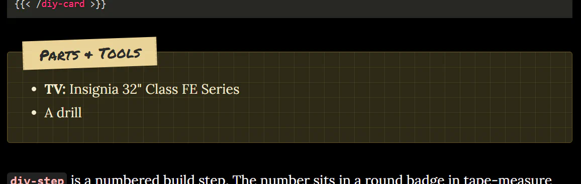
I moved the card and sticky note colors into CSS variables, and added a second set of values for dark mode. The browser picks the right set on its own. Every box now sets its text color together with its background.
Here’s the core of it, trimmed down to the card:
:root {
  color-scheme: light dark;
  --diy-card-bg: #fff59d;
  --diy-card-ink: #2b2b2b;
}

@media (prefers-color-scheme: dark) {
  :root {
    --diy-card-bg: #2e2a17;
    --diy-card-ink: #f3ecd0;
  }
}

.diy-card {
  background-color: var(--diy-card-bg);
  color: var(--diy-card-ink);
}
The color-scheme: light dark line tells the browser the page already handles dark mode, so Chrome’s forced dark mode leaves it alone.
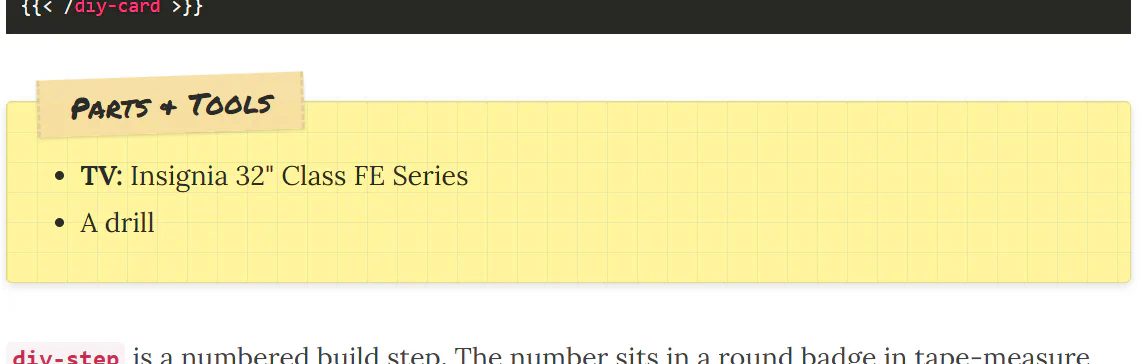
While I was in there, I also changed the light-mode card from tan to the same yellow as the sticky notes. I liked it better.
The best part is how little I had to touch. The card, the sticky note, and the numbered steps are shortcodes , and they all share one small stylesheet. The posts never mention a color. So the whole fix lived in that one CSS file. I didn’t edit either post, and every future post that uses these shortcodes gets the dark-mode colors for free. If I had pasted styles into each post instead, I’d be hunting down every copy by hand.
Here’s the same card after the fix. In dark mode it turns a dark olive brown with cream text:
In light mode it’s sticky-note yellow with dark text:
The habit
From now on, I check every styled post in both light and dark mode before I publish it.
You don’t have to change your whole computer’s setting to do that. In Chrome or Edge, open DevTools, go to the Rendering tab, and set Emulate CSS media feature prefers-color-scheme to light or dark. The page switches right away.
And after any CSS change, hard refresh before deciding it didn’t work.
I’m glad I went looking for post ideas on the gaming laptop. Next time I’d rather find the bug before I hit publish.